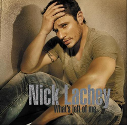
It kinda fits the song & where he is in his life right now. That's probably the theme of the CD. He has this empty look like he doesn't know where to go. It looks like he's in the desert which is just a wide open space, kinda symbolic. Sorry I'm a photographer so I like analyzing pictures...
Pathetic. If Jive Records is really going to invest in Nick's recording career - then they need to start thinking out of the box, and try to be somewhat creative. The typography (type used) is horrible from a designers stand point. You know there was a huge mistake made when the single cover looks better than the album cover. Look at the colors and texture used in the single cover and contrast them against the bland and otherwise forgetful album cover. Sad.
OMG>>Many of u guys are really over reading into nick's album cover..its just an album cover for christ's sake..it in no way offers insight into the material nick's album gonna offer..seriously anyone who judges an album by album cover has SERIOUS ISSUES!!..


")