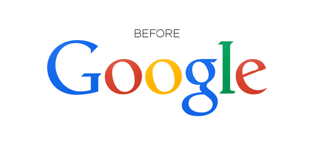
If you were browsing the internet at all this past weekend, there's a good chance you came across Google's ubiquitous logo at some point during your travels. What you didn't notice, however, is the fact that Google adjusted the letters in its logo ever so slightly—and it actually makes a pretty huge difference.
In Google's case the bottom of the"l" and "e" didn't quite lineup, and as redditor nal1200 noted, "[That] must have driven some design employee crazy." To fix it, Google moved the "g" one pixel to the right and the "l" one pixel down and to the right.


 I thought there was an actual change I didn't see…


