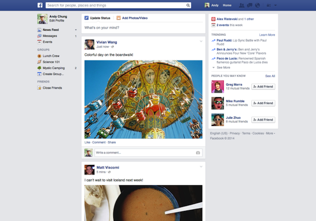
In a never-ending bid to make its news feed easier to use, Facebook has changed its look yet again. For one thing, the font will now be in Helvetica for Macs and Arial for PCs, which will make it look a lot like the fonts already in use elsewhere on your computer.
I don't know who first started the trend of shortening the logo to just the icon, if Facebook or Twitter. Anyways, I liked more the complete logo of FB rather than the icon. Different from Twitter, in which the little bird icon looks flawless instead of the logotype.