Back to ATRL
This is
Classic ATRL
, an interactive archive of our original website.
Music News
Charts
Videos
Celebria
Base
The Lounge
Best Of
YTT
Games
TRL Archive
User Name
Remember Me
Password
Members who joined ATRL prior to 2017, sign in here.
Any changes made to your password do not sync.
Classic ATRL
>
The Lounge
>
Discussion: eBay's brand new logo simplified
Sign In
Discussion: eBay's brand new logo simplified
Page 1 of 3
1
2
3
Next >
Last Post
Actions
Devon
Member Since: 1/6/2012
Posts: 12,011
Thread Starter
|
Post #1
eBay's brand new logo simplified
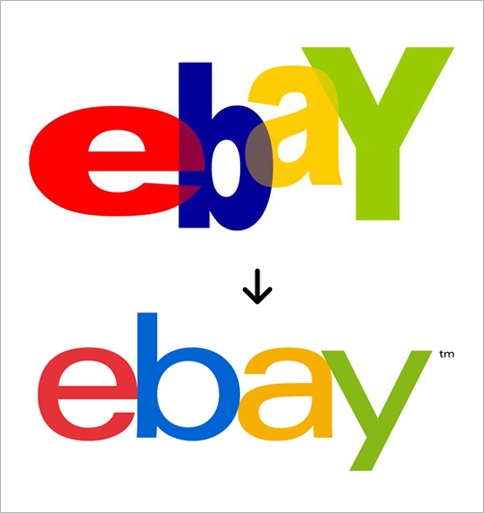
Compare this to this
SOURCE:
http://www.webpronews.com/ebay-is-ch...o-this-2012-09
ifyouseekLEM
Member Since: 9/23/2009
Posts: 26,796
Post #2
Oh.
It went from bad to worse.
Mister Martian
Member Since: 3/30/2011
Posts: 9,692
Post #3
Everyone is simplifying everything
Twai
Member Since: 7/22/2010
Posts: 16,134
Post #4
Well it's... easier to read...?
madonnafan18
Member Since: 5/31/2008
Posts: 11,688
Post #5
I actually like it.
Liberdade mi amor
Member Since: 3/22/2012
Posts: 9,573
Post #6
I like the second one better than the first one
stoopidjenna
Member Since: 10/15/2011
Posts: 6,480
Post #7
Looks more like Google, did they get bought out?
ifyouseekLEM
Member Since: 9/23/2009
Posts: 26,796
Post #8
Quote:
Originally posted by
Mister Martian
Everyone is simplifying everything
I know right?
Callum
Member Since: 11/4/2010
Posts: 34,287
Post #9
they're both basic as hell but i actually prefer the original, at least it had some kind of shape to it which would help make it a little more recognisable
now it just looks like a super basic version of google
Eaten By Lions
Member Since: 3/25/2011
Posts: 10,337
Post #10
I like it. Looks more modern.
Liberdade mi amor
Member Since: 3/22/2012
Posts: 9,573
Post #11
Quote:
Originally posted by
Mister Martian
Everyone is simplifying everything
The Adele impact
JK , well its not that hideous.
VJoker
Member Since: 3/12/2012
Posts: 7,400
Post #12
It looks more modern and way more classy.
I like it.
Midnight
Member Since: 1/3/2010
Posts: 21,098
Post #13
Reflects contemporary style, I guess...
Simple and uninspired...
vuelve88
Member Since: 10/16/2005
Posts: 16,872
Post #14
Nice!
Hustle.
Member Since: 11/6/2009
Posts: 7,375
Post #15
I could do this. I will make their next logo
e
b
a
y
There I did it. I'm a miracle worker. Give me my check plz.
Igrt
Member Since: 9/18/2011
Posts: 18,295
Post #16
Better than that scrunched up mess but everyone needs to stop with these basic fonts & logos.
Marq
ATRL Senior Member
Member Since: 9/22/2011
Posts: 16,128
Post #17
Quote:
Originally posted by
Mister Martian
Everyone is simplifying everything
!!!
XIAN
Member Since: 9/4/2012
Posts: 12,421
Post #18
eaux
Midnight
Member Since: 1/3/2010
Posts: 21,098
Post #19
Quote:
Originally posted by
Hustle.
I could do this. I will make their next logo
e
b
a
y
There I did it. I'm a miracle worker. Give me my check plz.
JessieJHeartbeat
Member Since: 3/20/2012
Posts: 6,167
Post #20
Quote:
Originally posted by
Mister Martian
Everyone is simplifying everything
IRK?! The concept of innovation is being thrown out the window.
Page 1 of 3
1
2
3
Next >
Actions for this Thread
Print this Thread
"Absolute TRL" 1999-2006; "Popfusion" 2006-2007; "ATRL" 2007-present