THE RESULTS!

Its been a very hard round for the judges, i can say that from my on experience, the covers have split the judges down the middle! refelecting the diffrent taste of the judges/ The qaultiy of the covers far exceeded what i expected and all contestants have produce uber cool covers and it makes me happy seeing how good they all are.
read the rest of post to see whos elimnated!
btw i hope everyone appreicates the time it took me to get this right lmao  THE JUDGEING ORDER! ( SAME THROUGHT RESULTS)
Eteru
Active beast
Evan
;; Allen::
Tinkerbellbritney
ME
Lady Roc
Duca
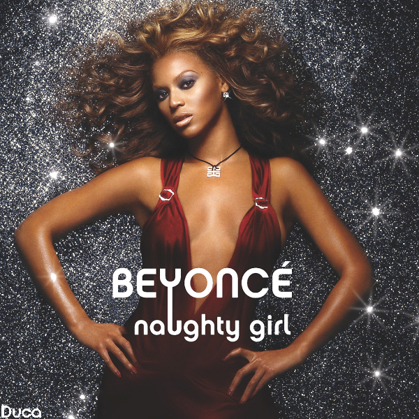
Duca: 9/10
Duca (8.5/10)
I like the background and the pic used. The only thing I don't like much is the font used. I hope a more fancy font was used. But it's still great.
Duca - 9.5/10
Good job! I love it; the "y" dipping into the "u" is very creative! Could've been a bit better though.
Duca (7/10)
I like the sparkles in the background and the font is okay but I found the picture didn't fit with the song. If the picture was blue or purple it would fit better with the background.
duca-9/10!
9.5/10 cool bg, awesome quality, liked the whole idea of it
Duca- 7/10 The Picture definitely works, Not to crazy about the Font.
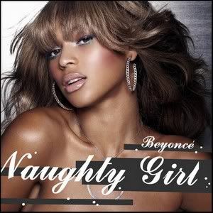
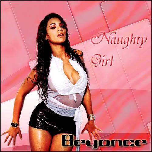
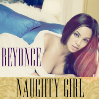
HotNCold

HotNCold: 8/10
HotNCold (8/10)
Same with Duca's, a fancier font should've been used. But overall, it's nice.
HotNCold - 7.5/10
The picture is good, but the font really isn't working for me at all. The cover also does look cheap.
HotNCold (8/10)
- The font really fits the cover but I don't like the use of the picture. It's nice but I find it's kinda cheap to use a picture that looks so much like the cover for the album. Don't be a cheap record company.
Hot n Cold-8/10
Hot N Cold – 8.5/10Naughty ! love the pic and text but maybe could have been a bit more orginal!
8.5pts I love everything about this cover. From the Pose to The Font and The
Background.
Good Job
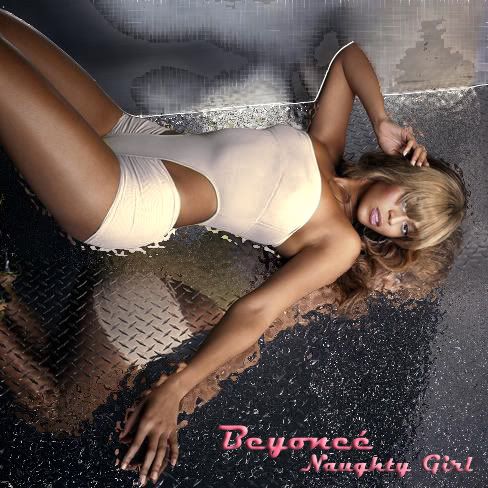
Kod
Kod: 8.5/10
Kod (9/10)
I like it. Simple but classy. And Bee really looks naughty in that pic. :Worship:
Kod - 7.5/10
It's a good font and okay picture, but what's with the random spots of gray? They make the cover look less professional.
Kod (7.5/10)
- The font is nice with the backfround and the black squares but the picture is hideous. The only way to make this picture look nice is to chop of the bangs.
kod-8/10
Kod 10/10 dirty!, awesome amazing everything just superb!
2 Kod [ V ]
7.5/10The font doesn't mesh well with the Pic.
Mikey
[spoiler]
[/spoiler
Mikey: 9/10
Mikey (8.5/10)
- 8.5/10I like the theme. So glamorous. But again, the font. Fancier one would be better.
Mickey
(8/10)t's pretty good, but I just think the font could've been better.
Mikey-7/10
I love the font and the effect, the background is amazibng, but the picture choice could have been better. The hair looks like her hair in Ego, it's not a good thing.
mikey
8.5/10 It really well made the background is amazing and your skill must be Immense but I don’t really like the beyonce picture sorry!
8 Mickey
8pts This pic is HAWT, I love the Background.
mUsIcLoVeR
- mUsIcLoVeR -: 8/10
-mUsIcLoVeR- (8.5/10)
Great font. A Bee trademark. I like the background and the effect. But I hoped you used a naughtier Bee pic. She's very dressed in that pic.
-mUsIcLoVeR- - 8/10
This is a VERY good cover. The only problem is that I don't see the picture working for the song, "Naughty Girl".
-mUsIcLoVeR- (7/10)
- The Beyonce font is commonly used with her covers. I think the picture does not fit the cover, but is a nice picture overall
musiclover-8/10
8.5/10 again awesome skills, your all so talented . But I didn’t really think the picture suited the song and was not very naughty imo.
mUsIcLoVeR-
7.5pts There nothing Naughty about this!
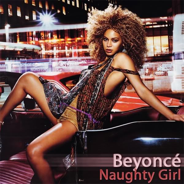
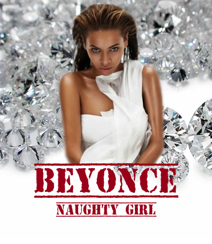
Pedro
[
Pedro 7.5/10
Pedro (8/10)
I dunno but the pic reminds me of RiRi. But I like it. The font again..
Pedro - 8.5/10
The picture is really good, but the font looks a little cheap.
Pedro - (8/10)
- Everything is nice but the font. I think if you changed the color you could have scrapped together a 9.
Pedro-8/10
9/10 bg great, picture great, text is fairly good, just really disliked beyonce fringe without it could have been higher!
Pedro
9/10 This is by far my Fav
Sir Frost:
Sir Frost: 7/10
SirFrost (7/10)
Bee looks naughty in that pic but I hoped you use a better background. Maybe a grayish-black background would fit better.
SirFrost - 5.5/10
It's okay, but it is really lacking in many aspects. I don't really like the font, and the cover as a whole does look pretty cheap. Sorry. Your cover is just not at the level of the other contestants, but I know you're a beginner, so with time and practice I think you can get better!
SirFrost (6/10)
- The background isn't nice, it looks cheap and tacky. The picture is sexy and the font fits the picture.
sirfrost-9/10
9/10
Cool picture im feeling it
: nice text, and the bg must of took ages and I think it looks great.
Sir. Frost
7.5pts. The cover looks cheap The Pic is Hawt Though.
Satellites
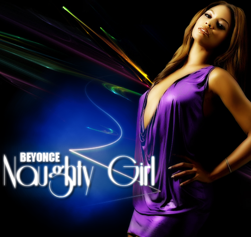
Satellites: 8/10
Satellites - 10/10
It's amazing! Love the Naughty Girl font, and the picture, along with the background, you chose is brilliant!
Satellites (8/10)
I like the pic. Bee looks fabulous in violet. And bow to the font. I guess other backgrounds would fit better for the song.
Satellites (10/10)
The picture, the font, the lighting, EVERYTHING! PERFECT!
satellities-9/10
Satellites 9/10
Again great editing skills just not sure on the bg looking forward to the next picture
Satellites
8pts. You can tell u really work hard on this cover. I notice you change the color of the dress
Riot
Riot: 7/10
Riot - 8.5/10
I love the picture and the background, but I think the font could've been better.
Riot (7.5/10)
Simple but elegant. I like the crystal-thingy background.
Riot! (8/10)
- Sexy picture, and cool font.
riot-6/10
Riot
6.5/10 – I really liked the concept but there seems to be a little editing problems with her arms, they looked fairly deformed. And I didn’t reall like the font but I think you have talent.!
Riot!
6.5pts At first I love it, but then I start to analyze it
The pic is HAWT, but the background and Text doesn't scream Naughty Girl.
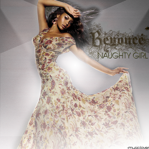
ASHDUFF
ashuduff: 7/10
Ashduff (9.5/10)
I love this. Though this kinda reminds me a lot of Halo (I dunno why). Beyonce font trademark. The effects The pic isn't revealing but it looks a bit naughty coz of Bee's cleavage The best cover for this round.
Ashuduff - 8/10
I really like it, but I think it's a little too simple for this song. This cover would work really well for a different song, like "Me, Myself & I". But it's still a really good cover.
Ashduff (8/10)
- I like the picture and the font is okay but the lighting and the coler is kinda weird.
ashduff-6/10.
ashduff 7/10 good, but boring would be great cover for if I were a boy
8.5. I love the Pic you use.
SOOO what youve all been waiting for the TABLE
The Table (averages)
As you cant tell it was very close! and came down to just a few points....
Satellites - BOW DOWN TO THE KING OF ROUND 1
8.9 Well done you have immuity but i still want you to send you artwork in!
Duca
8.5/10
Pedro
8.3/10
Kod
8.3/10
Mikey
8.2
HotNCold
8.1/10
mUsIcLoVeR
7.9/10
ASHDUFF
7.7
Sir Frost:
7.3
Riot
7.1 
sooory
This means with great regret that we have to say bye to riot this round im sorry i thought you had potential look forward to seeing you renter next season!
Stay tuned for challenge 2!


")
") thank you
thank you 


 Riot! I'm so sorry, I actually thought mine would be the first to go. Yours look really good, especially the picture of Beyonce you used, her expression so fits the title of the song and the text is also amazing.