


Using what we learned from Lesson 1 & 2, we’re going to make an avatar using the music video for “Only Fooling Myself” by Kate Voegele

Video Training now includes basic explanation so you don’t get lost. The full tutorial is just below the video demonstration.
Note: This tutorial assumes that you have read the “Getting Started” & “Enhancement & Filters” tutorials. If you have not read them already you may be lost when reading this tutorial. You’ve been warned

Here I have imported my frames into Photoshop and resized it to 125 x 125.
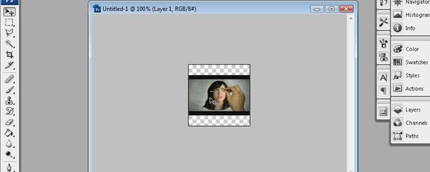
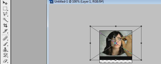
Now we need to resize the Music Video so it fits with the rest of elements we’re going to add later on. Hit CTRL + T and resize the video as shown in the example. Hit Enter on your keyboard to complete the process.
The video could use a little touch up so go to Layer > New Adjustment Layer > Brightness & Contrast. Make sure “Use Previous Layer to Create Clipping Mask” is checked. If you leave it unchecked, the Brightness/Contrast will affect everything under it and we only want it to affect the Video.

I’m setting the Brightness to +48 and the Contrast to +34

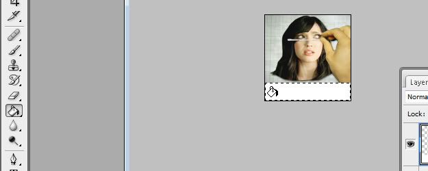
At the bottom of the avatar we have a black bar followed by blank space. Make a new layer and use the Marquee tool from the Tool bar to draw a rectangle at the bottom where the gap is. Now use the Paint Bucket tool to fill it with white.
It’s now time for the caps. Open “Free Video to JPG Converter”; load the video in and scrub the timeline bar across until you find the picture you want to save. This time all you need to do is hit “Make Snapshot” and that image will be saved in the folder you chose under “Output Folder”.
Continue this process until you have all the caps you need.
Back in Photoshop, open the folder where you saved the caps, highlight all of them and click Open.

The effect we’re going for is similar to the one in the music video where the pictures look roughly cut out. To get this effect we’re going to use the Polygon Lasso Tool. With it selected, trace around Kate by clicking different points on the image. Once you traced all the way around her, end the marquee selection by clicking the point where you started.
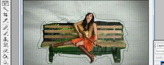
Now hit CTRL + C on your keyboard to copy this area and go back to the avatar window. Hit CTRL + V to paste the image on its own layer. Repeat the process with the other cap.
Once you have both caps in the avatar, resize and position them as shown in the example below.
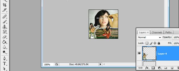
To enhance the quality of the caps, go to Image > Adjustments > Brightness & Contrast then drag the handles to the right as shown in the example. You can also enter the numbers in the image below.

Now that we have both images cut out, resized and enhanced, let’s make them look like they’re floating over the video.
Click the “fx” button in the layers window and choose Drop Shadow.
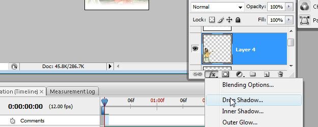
Enter these settings:
Distance: 3
Size: 4
Color: Black
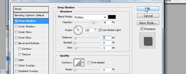
Before you close the styles window, save it as a new style by clicking “New Style…” and enter the name “PaperShadow1”
Now you can close the Layer Styles window and select the other cap without the shadow. This time, scroll down on the Styles Window in the Side Dock and choose “PaperShadow1”.
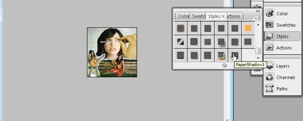
Once both caps have shadows under them, create a new layer on top of everything and use the gradient tool to make a small white gradient at the bottom of the layer.
First make sure your color is white and then select Gradient Tool from the Tool Bar. It might be stacked under the Paint Bucket Tool, so if you see the Paint Bucket tool, hold your mouse down on it and you will see the option for the gradient tool.
Once you have the Gradient tool selected, go to the top options and make sure the gradient type is set to the one shown in the example.
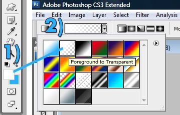
Once you have those things set up, click and drag from the bottom to about a third of the way up on the avatar. The reason we are doing this is because we want the text to be readable once we add it.

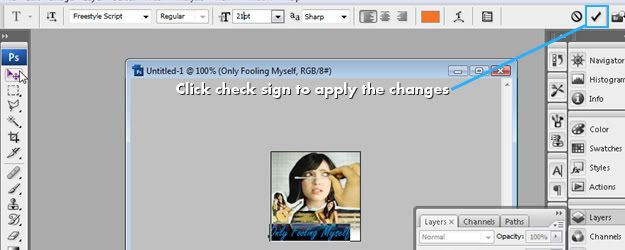
Now let’s add some text. Choose the “Type Tool” in the toolbar and click where you want it to be. At the top options, choose the font and size you want to use (I’m using Freestyle Script and a font size of 21px for song title). Type in the title of the song name and click the check sign to apply the changes (You can also hit CTRL + Enter to apply the changes).
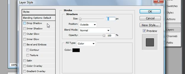
Now choose “Stroke” from the “fx” menu and apply these settings:
Stroke: 1
Color: Black
Then click “ Drop Shadow” and apply these settings:
Distance: 2
Color: Black
Size: 0

Click “New Style…” and save it as “ShadowText”
Make some more text and this time give it a font size of 30px. In the Style Window, scroll down and choose “ShadowText”.
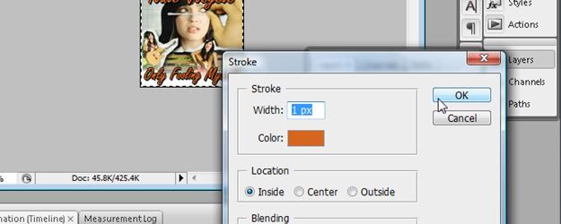
Create a new layer and make sure it’s at the top of all other layers. Use the Box Marquee Tool and drag over the entire stage (You can also hit CTRL + A to marquee select the stage). Now go to Edit > Stroke and set the stroke width to 1px and give it an orange color.
Preview your avatar by clicking the play icon at the bottom of the animation window. If you like how it looks, save it by clicking File > Save for Web & Devices. It’s important that you set the “Looping Options” to Forever. Leaving it on “Once” will mean your avatar will play once and then stop.

Here’s what it looks like once we save the .gif:

Hope you were able to learn something from this tutorial. To play around with the avatar file and get the offline version of this tutorial, click “Download Exercise Files” from below.
Credits: Athens (Author) Orange/Ke (Tester)


