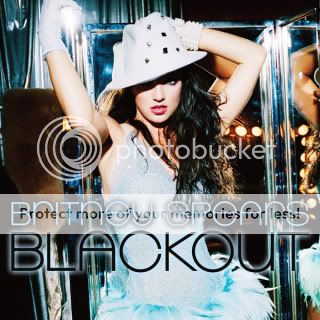
blackout too low. the design is tacky but that is one of her best photoshoots.
The photoshoot is amazing, which is why the cover is a travesty.They had so many picture to choose from and they did this:
What made them think this would be okay? And why would they chose ORANGE squares?
Blackout, BJ and FF covers suck. The rest are good.
She looks fierce in the Femme Fatale cover. She actually has fire behind her eyes. The art deco font is also nice and it is cool how they worked in the number seven for her seventh album.
Always thought this picture was more FF than the whole FF photoshoot. That V magazine shoot was so good, i hope Jordan's right about her having another spread with them.
Always thought this picture was more FF than the whole FF photoshoot. That V magazine shoot was so good, i hope Jordan's right about her having another spread with them.
Taste
Quote:
Originally posted by geddymonster
She looks fierce in the Femme Fatale cover. She actually has fire behind her eyes. The art deco font is also nice and it is cool how they worked in the number seven for her seventh album.
Gurl she looks dead af behind the eyes. What kinda mess?

 The rest are good.