I was a huge advocate of flat design ever since Microsoft's introduction of it in their Zune music players and Windows Phone 7 operating system. It just looks so clean and modern. Android and iOS quickly followed suit in the years that followed, so did every website, design agency and medium available to man.
And now it's just overkill. It's everywhere! It's looking samey. It's even bleeding to our favorite popstar's music videos (Meghan Trainor's "All About the Bass" and "Lips are Movin'", Ariana Grande's "Problem", Zara Larsson's "Lush Life" are prime examples of this), simplistic album art and concepts.
Looking at the skeuomorphism present in early iOS versions, I can't help but wonder if this design language would ever be back. I miss it so much. It has character/soul, if that makes sense.
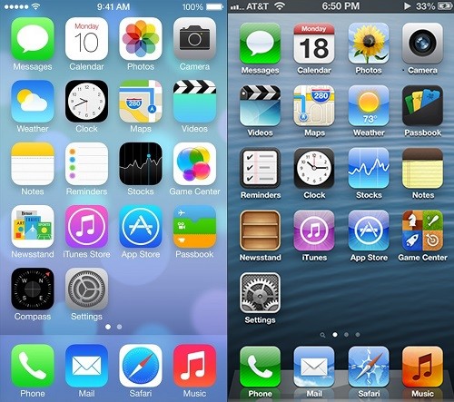
(Left: Flat design, Right: Skeumorphism)

Skeumorphic Newsstand

Flat Newsstand

Flat vs. Skeumorphic Weather app
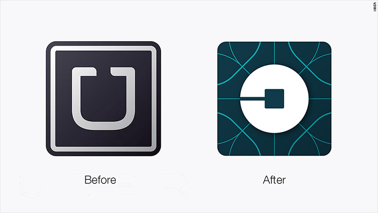
Uber
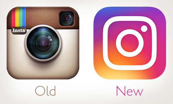
Instagram

Microsoft

Netflix

Siri, Then

Siri, Now

MasterCard
The images below accurately sums up the lack of visual diversity, thanks to flat design:


